Monday, November 25, 2013

Wk 6 Digital Painting - Mood boards & Making Dragons

     This week, for the first part of the assignment, we were to take a subject we don't like, then redesign it, by creating moodboards- a collection of images where we can show the concepts we have in mind, in re-envisioning the subject we chose. For the Mastering Animals part of the assignment, we were to design a dragon.

    While researching for this, I came across some paintings of Saint George Slays the Dragon, typically depicted like this....A knight riding a white horse, about to slay a dark-colored dragon, with a spear or a sword, while a princess looks on from a distance. The dragon represents evil, while the princess represents different virtues


     I'm not much into dragon fantasy, so I'll consider this as my Not My Favorite part of the assignment. I thought this concept would fulfill both parts of the assignment. While collecting costume, look and style references for St George and the dragon, I envisioned St George as a hero archetype, well-built, good-looking, in dynamic poses, inspired by Frazetta's paintings. And I thought a bigger dragon would be more menacing and and dangerous.  I also thought of changing the typical staging, into a more cinematic and dynamic composition.


      Quite an ambitious task. Not sure if there'd be enough time. So I decided to just focus on designing the dragon, and see how I go.  So here's a few sketches I did, using reptiles like crocodiles, iguana, komodo dragon and other reptiles as the basis, which is similar to the story, but I haven't decided if  it would have wings or not.


     Halfway through my research, where the typical dragon I see were the big, ferocious, fire-breathing monster kind. I felt overwhelmed, so I changed my mind about the whole concept and decided that instead of scary-looking, ferocious, flesh-eating monster, I'll go for a pet dragon instead, much smaller and cute.  So I started to play around with this new idea and came up with two designs and a little character personality and descriptions:


     Still maintaining the bat wings, the first one is a combo of Camel/Llama, with Lion body and Tiger stripes, plus serpent tail, lined with spikes.  This dragon is a small one. Not very strong due to his small size.  Doesn't spit fire but spit a lot of foul-smelling saliva.  Haha.   Can fly very fast. Smart and funny, and talks about a lot of good knowledge but also a lot of nonsense.  Pretty much a good pet and friend to any young wizard-in-training. Eats a lot of fruit, particularly berries. I haven't decided the colors yet. Will play around as I go.


     The second one is a Hippo Dragon, a combo of Hippo head, and a  fat puppy -like body, covered with reptile spots. and has reptile tail. Also lined with spikes. His feet have claws. Also have bat-wings but too tiny to really help him fly. He can glide though if he jumps-off from a high place then sort of glides down. and flies more like a chicken. Really pathetic. That's why he's sad-looking.    But a real darling and puppy-like.  A good pet too.  But don't get fooled for his real power lies in his strong ability to let out a big yawn with fire, that easily disintegrates anyone who mistakenly cross his master. Ha!

     So... I find myself developing these pet dragons further, and now enjoying it. I refined the drawings a bit more. and also realized that my original Hippo Dragon sketch, didn't actually look like a Hippo, but more like a Rhino, So I revised it to look more like a Hippo now.  I started to do a grey scale study of it. And played around with some colors, but haven't decided with a final one.
                                                                                                                                                                                  
     The thing I like with starting in grey scale, I can play around with colors.  And so I did.  Here's what I came up so far.  Since Hippo Dragon is more of a pet than a menace, I decided to give him some bluish colors with touches of pinks. His spikes are translucent. His personality is more on the quiet, timid, shy type, but he can be dangerous when angry. Remember, he's got a deadly big yawn with fire, that disintegrates any enemy.

     His wings are very thin and small for his size. It's more a remnant from his dragon ancestry.  It doesn't really help him to fly but do help him to glide down when jumping off from a high place. He doesn't fly that high, more like how a chicken fly. His ancestors were powerful dragons and they all spit fire, but since his great, great, great grandfather had been captured by a powerful wizard and made into a pet, the succeeding generation of dragons had been very docile and their powers unused, their flying skills undeveloped.  Thus gradually became almost useless.  Except for the spit-fire power.  It never went away, but would now require him to be really, really, really angry for that to happen.

     It's quite a challenge, since his personality doesn't lend him to get angry easily. But one thing that does, is if anyone harms his master. A true loyal and protective pet, he is. Definitely a good companion for any young wizard-in-training.

Here's Hippo Dragon in color.... (click to enlarge)


     So, I started the week, not quite sure if I would enjoy this assignment. Having to do a subject we don't like and turn it into something we like.  I think I succeeded. I like this dragon. Although he may undergo some more changes if I develop him further.

     And what about St. George Slays The Dragon concept?  Hmmm...  I'm not abandoning that concept quite yet.

     To see previous weeks, click here : Week 1, Week2, Week 3, Week 4, Week 5

Monday, November 18, 2013

Wk 5 Digital Painting - Big Master Study

For this week, I only managed to do one part of the assignment, which was to do a big master study, with at least 1 full body figure and a landscape background.  So I chose William Bouguereau's Homer and his Guide (1874) for this assignment. 

I decided to start the painting in tonal values, to prevent me from getting distracted with colors at a stage where I want to accurately capture the correct proportions and likeness of the original.  I placed the characters and the dog on separate layers so that any adjustments later on would be easier.  It seemed that this is a slower method. It took me 5 days to finish Homer, the boy and the dog. But it only took me a day to add colors to them. I wonder how long it would have taken me if I used the other method of painting them straight in color. 

For the background, I decided to use the second method and it took me just over 2 days to finish it, together with the additional characters and dogs in the background.  Since they are secondary characters, I can be a little less accurate with them. These extra characters are on separate layers as well. I also divided the background into 3 layers: BG, middle ground, foreground, so that  I can paint them in broad strokes.  I used some custom brushes for the clouds, rocks, ground.  I didn't attempt anymore to match exactly  the original background but just tried to capture the essence of it, as I don't have the patience to.  Same with adding the texture of the basket. I hand-painted it as I haven't discovered any PS tricks yet to do it quickly.

For Homer, the boy and the dog, I used a custom brush called Tyrion from the Shaddy's brushes collection. I'm liking that brush that it's mostly the only brush I use.  I tried to capture the likeness of the original, but for the details like their hair, and the dogs fur, it's not an exact copy. Again I have no patience and don't see the point, except to just capture the essence of them.  Even for the color palette, it's just an approximation.  I think I got it pretty close.

I wasn't expecting to finish this assignment on time, but I did.  But I ran out of time for the animal studies.  I knew that that would be the case, so selecting this painting is a chance for me to at least have some animals incorporated in it already.

Here's my study for the week in progressive versions... ( click to enlarge)


To see previous weeks, click here : Week 1, Week 2, Week 3, Week 4


Sunday, November 10, 2013

Wk 4 Digital Painting - Full Body Painting and Animal Heads

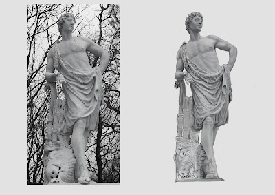
This is the fourth week of my digital painting course.  By this time, I'm already comfortable painting digitally. I'm gradually learning Photoshop tools while completing a painting.  Our topic for the week was to paint a full body figure with drapery.  From the different statues given to us, we're to choose one, or use the previous statue we did from the previous week 1 and 2 assignment.

I started with my previous Vienna Statue sketch from week 1, using the finished head painting of week 2 and reduced it to the right size to continue painting the whole statue. I blocked out the body for a day, and planned to finish it the following day.  But I got sick and wasn't able to finish it.  The day after, I was a little bit better and tried to resume working on it.  But I got tired and bored with it so I didn't finish it.  This is the farthest I went with it..... (click to enlarge)

Unfinished Vienna statue painting


 I need something new this time, so I chose this statue for this week's assignment.  A man for a change.

Rough sketch

This week we're encouraged to try some custom brushes we've downloaded from last week.  After I unsuccessfully tried out the Fur brushes during the week 3 assignment, I decided to give this Shaddy's Brushes collection a chance this time.  For this full body painting, I used the brush called Tyrion Lannister. 

Every now and then, I would flip the image to get a fresh eye, which really helps in catching any off-proportions.  I also made the background lighter in color, similar to the photo, as I was having a difficult time seeing the correct value. Once it is finished, I switched the background back to black.  Here's the Full Body Painting in progressive versions.


Later on, I found that the statue looks too pale on a black background so I adjusted the overall contrast to match the black background.  Here's the finished painting...


This took me 2 days to finish, Not counting the extra day I spent on the Vienna Statue. This is becoming the time frame it would take me to do one painting.  

The next half of my assignment was to paint herbivore animal heads - a horse and a cow or bull.  For the horse, I used the Khal Drogo and Tyrion Lannister brushed from the Shaddy's brush collection. Here's the painting in progressive versions...


 I still haven't figured out how to use the custom Fur brushes according to how I want it to, so I just used the brush no 5 and 6 for the hair and fur again.

Next was the cow head.  Same as the horse, I used the same brushes to complete this painting. Here they are in progressive versions...


Yey! I finished all of my assignment with still a day to spare.  I'm really pleased with my speed so far. One thing that I realized this week, is that the human and animal anatomy lessons I have been trying to learn over the years before, is paying off now, Understanding what's underneath those skins is really useful and actually helps me to be able to do the painting more quickly, and hopefully, more convincingly.

More paintings in the coming weeks.  Till then....

To see previous weeks, click here : Week 1, Week 2, Week 3

Sunday, November 3, 2013

Wk 3 Digital Painting- The Head In Color And Painting Fur

My digital painting journey continues....

Continuing with last week's lesson on value study, this week our assignment is to paint portraits in color, using two methods. One is adding colors using layers. The other is color mixing with brushes.

In the first method, I chose William Adolphe Bouguereau's Le Petite Mendiante as my Master study.  In this method, we start with a black and while value study , then on another layer we will add color.  Since I did the value study of a Vienna statue last week, I was pleasantly surprised that I was faster with this assignment.  I almost managed to finish this value study in a day!  (It took me more than three days with the statue.) I was really pleased.....(click to enlarge)


The following day, I added more refinements and details to the value study, thinking that if I do more at this stage, adding color to it would be faster. So I added the wrinkles on her blouse and worked on her tones further, flipping it often to catch any distortions and off-proportions.  I'm really getting the hang of working in Photoshop with it's Distort and Warp tools. I'm still just using two basic default brushes here, brushes 5 and 6.  Now that it's done, it's time to add colors.


So the same day, I added the colors.  Like I suspected, it was quicker. I glazed the colors on top with another layer which is set to Color mode.  Although, I realized that some colors became muddy as we have been told, so it wasn't as simple as I originally thought. I added another layer and mixed and blended the colors normally to achieve the correct color.


I made further adjustments and finished it off the same day. I have to make sure I have enough time to do the other method and there's still the animal paintings to do as well.  So here's the final version.


The following day, I started with the second method, where we start with colors right away. Because I haven't done this method before, it seem to take me longer. I cheated with the color palette where I used the color picker to pick the colors off the original, instead of picking it myself.  I think if I gain more experience with this method, it might prove to be a faster method. For this study, I chose Lord Frederic Leighton's Biondina painting.  Here's the rough version...


Continuing still the same day, I worked on it further, adding details on the hair and clothes and refined the face.  I was trying to capture the likeness, but in the end, the closest I can get her to look like is..... her older sister. haha.
I have to let it go, or I'll never finish the other half of my assignment for the week.


The next day, I now focused on animal painting, where we were to paint two animals - a long-haired and a short-haired.
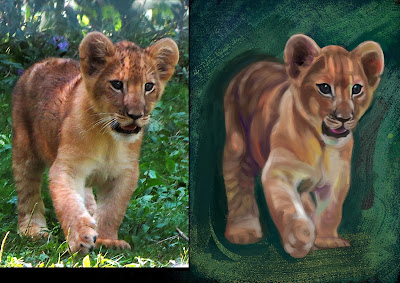
I chose a cute lion cub for the long-haired animal. I guess after spending 2 days painting directly with colors, gave me enough familiarity and practice that I managed to finish this painting in a day.  I'm really pleased with my speed and the outcome. Here's it is in progressive versions....


Then for the last one, a short-haired animal, I chose the horse.  And just like the lion cub, this also took me a day to finish.


With fur, there are custom brushes that we can use. Unfortunately, my Photoshop version isn't compatible with my instructor's brushes so I downloaded those I found elsewhere.  I'm still trying to figure out how to use those fur brushes. I found them not suited to how I want it to look,because the strokes are in the wrong direction.  So I just used some of it sparingly on the horse, but not on the lion cub.  Maybe I'm using it wrongly, I will have to ask Anne, my teacher about that.

In a matter of days, I think that I'm really adapting to the second method of painting quickly.  This is really exciting for me.  I can't wait to learn more....

 To see previous weeks, click here : Week 1, Week 2