I decided to extend my Drawing Cats Week for a few more days. I'll be doing new ones soon. for the meantime, here's an old sketch.
Showing posts with label animal drawings. Show all posts
Monday, May 8, 2017
Daily Sketch Day 32 - Cat Poses
Wednesday, April 26, 2017
Daily Sketch Day 20 - Pringles
Today, I have again asked some friends to lend me their pet dog's photos, so I can draw them. So for today, it's Pringles - a smiling Pug-Pitbull mix. Her big wide smile is so cute I just have to draw her. She can be a good inspiration and reference for a character design of a dog character in an animated film.
As for the background, I added a Stucco Deco design using the art clippings brush preset in Artrage 4, for the floor, and added some spot lighting effect to the whole image. Coz she's a star!
Monday, March 30, 2015
Animal Drawing - Final Week
For week 8, the lectures were about prehistoric animals and some rendering. Finally, I'll have my weekends back. It's been really challenging 8 weeks, because I didn't have much time to do more research and sketches to understand the process, with only the weekends to do it. And yet, I still enjoyed doing these assignments. The subject of drawing animals is really very broad, and for 8 weeks, it's just scratching the surface. There's just so many different kinds, types, species of animals one can learn about, that it's a lifetime's worth of study.
I also got sick this week, so I only managed to these. Artrage 4 had been the program I've been using in doing all of my assignments. Here's what I've done.
Monday, March 16, 2015
Animal Drawing - Week 6
For week 6, the lectures and assignments are about drawing unusual shaped- animals. These are the fishes, and reptiles. It's also about how much or less details, textures are indicated so as not to kill the drawings. This is something I plan to practice on even after this workshop is done.
Here's what I've done. ( click to enlarge)
Monday, March 2, 2015
Animal Drawing - Week 4
For week 4's topic, it's about active and passive muscles, and animals in action, and being able to draw animals from gesture, construction, and with muscles overlay. For my assignment, I concentrated mostly on dogs and a cat. I chose photos where there's interaction between animals.
Here's what I've done. ( click to enlarge)
Monday, February 16, 2015
Animal Drawing - Week 2
To see Animal Drawing Week 1, click here.
This week's lesson was about animal skeleton and basic construction. This was one of those times when I really struggled drawing. I have not drawn animal skeletons before so this week's assignment had been difficult. If I don't understand what I'm drawing, I won't be able to draw it well. So, I took out all of my animal drawing and anatomy books as references. I think after this course is over, I will revisit all the lessons again and do a lot of practice.
Here's what I've done. (click to enlarge)
Monday, February 9, 2015
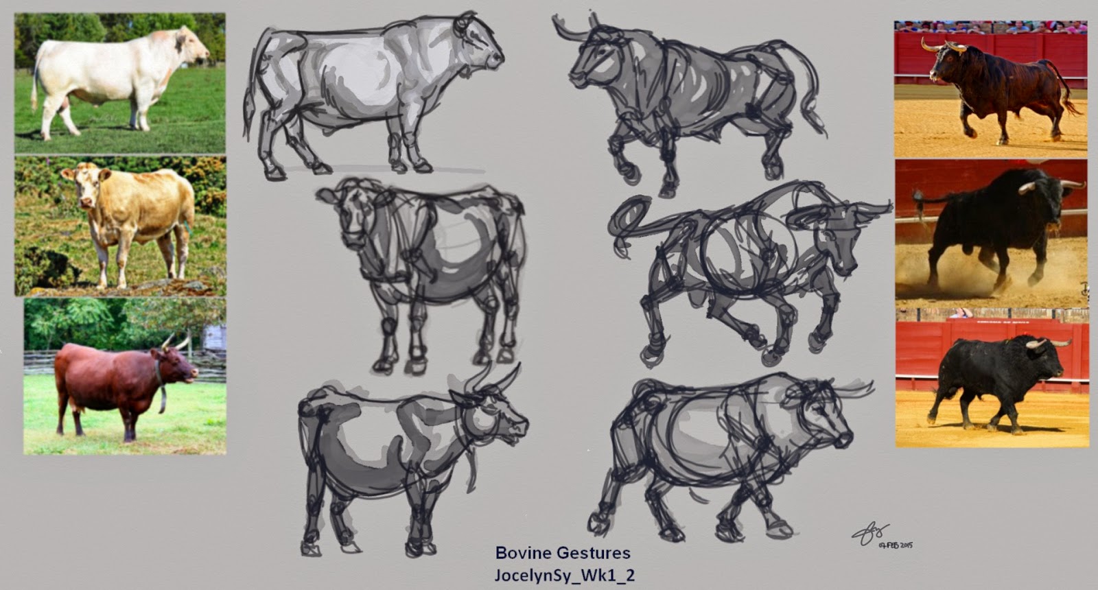
Animal Drawing -Week 1
I'm at it again! I'm presently enrolled in another online drawing workshop. Art education has always been something I wanted to continue and thanks to all these online schools, I'm now able to do it at my own convenience.
This time, it's Animal Drawing at CGMA 2d Academy. Being a 3d animator, it's easy to neglect sketching or drawing after a long day's work. So, this is my way of forcing myself out of laziness to start sketching and drawing again.
For week 1, here's what I've done.... (click to enlarge)
Tuesday, December 10, 2013
Final Wk Digital Painting - St George & The Dragon
In this 8th week, after doing thumbnails and brainstorming about the composition, character designs, poses, and color for the St.George Slays the Dragon painting, and arriving at a consensus with my instructor on which of those studies I should go for, I've decided to start the painting in greyscale and deal with the colors much later after I resolve the design and poses of the characters first. Understanding colors is still a challenge and difficulty for me. So I need to approach this painting in a slow and methodical way.
Focusing first on the main characters, I started sketching and painting the horse, which I've decided would be white. Gathering references for the horse was quite a challenge, since it is an original design, and it was difficult to find an exact pose like that of my horse design. So I just relied on what I know and looked at different photo references and hopefully, it looks believable. Here is the initial stage of the painting of the horse in greyscale. (click to enlarge)Then St. George was next, I haven't resolved his design and costume yet, so his look evolved as I went on. Same with the design and colors of the dragon. This is how I am, ideas doesn't come to me quickly enough. I seem to get ideas as I go, thus making my painting process quite slow, and time consuming. Here's the initial design for St.George...
After a good night's sleep and fresh eyes, I looked again at my design of St. George and now disliked it. So I spent another day changing his look, pose and costume completely. I have to gather some photos of good-looking Hollywood actors as reference, and I got inspired by the idea of a superhero. So.... my St. George kinda look like the Man of Steel. Haha. I revised his costume to be more a black sculpted armour with a cross in the middle of his chest. And of course... a cape. He's not wearing any helmet, so we can see his face more. I know.... he's more vulnerable against the dragon's fire, but who wants a hero you can't see the face of. I digress.... So here's the new design of St. George with a cape now. I also started sketching the dragon in a bit more detail...
Then I started blocking the dragon roughly and revised George's cape to be flowing more upward.
The following day, I found the dragon's wings seem lacking in terms of design so I revised it to look like it's tattered. I also added some horns on his head to make him look more fierce and scary. He's the bad guy in this piece representing evil, so the uglier and bad he looks, the better.... At this stage, I'm quite satisfied with the designs of the characters that it's now time to add colors.
For the colors, I wanted the setting to be dark, maybe around dawn before the sun rises. And yes, the cape is red. Then I clumsily tried to figure out the lighting scenario of this piece and this is what I came up with.
Not quite sure how I'm doing in terms of colors, I asked a friend who have more experience in digital painting to have a look at this. He kindly gave me some suggestions and I love what he did that I almost followed everything he suggested. Thanks to my animator friend, Chan Ghee Leow, for giving me some useful tips. Here's an improved version. The lighting is more intense and dramatic. The dragon seem to want to burst into flames in demonic anger. Hahaha..
I further added some background details and improved on the dragon details. Darkening the scene a bit more.
I further revised the pose and design details of the dragon and
clarifying a bit more it's details. There's a subtle secondary light
coming from above that I wanted to include which signifies God.
Playing around with the colors and lighting further, I finally settled on this one where the colors are a bit purple-ish and the scene a bit more darker. After an incredibly exhausting 8 weeks, here, finally, is my first concept digital painting of St George Slays the Dragon.
I still have so much to learn in terms of colors and light, aside from digital painting techniques, composition, and character designs. And I think it would take me some more time and experience to be able to judge objectively the quality of my own work. But for now, I consider this an accomplishment, and a start. Prior to undertaking this course, I always find digital painting intimidating. Now that I've taken these first steps, it doesn't seem that unachievable for me anymore.
To see previous weeks, click here : Week 1, Week2, Week 3, Week 4, Week 5, Week 6, Week 7
Monday, December 2, 2013
Wk 7 Digital Painting - Redesigning A Myth
After weeks of getting used to digital painting using Photoshop, it is now a chance for me to put what I've learned into creating my own digital artwork. Last week, I playfully designed my own dragon, something that's not a particular interest of mine, but I enjoyed the process just the same. Using the moodboards and research I've already started last week, I decided to continue this subject and will now try to redesign "St George Slays The Dragon" painting.
So week 7 is all about thumbnails and brainstorming. Quick and dirty, just laying out ideas about what the story will focus on, and how it would look like. Here's the rough thumbnails I've came up with... ( click to enlarge)
I haven't decided on how the dragon would look like at this stage, but just playing around with composition. I've decided St. George to use arrows to fight the huge dragon, riding his white horse. He needs to be able to get away from the dragon fast if he needs to. I'm also adding light as a symbolic element, to represent God or Grace to help him win over the dragon which is the symbol of evil.
So the first two panels, the dragon would have wings, and the lower two panels, the dragon would be huge but wingless. I'm focusing on the main characters in the scene first, and on how to stage the story. The background at this stage isn't clearly defined yet.
The first panel is a direct face-to-face confrontation. The second (top right) is the ending where the dragon is already killed, and St. George gratefully looks up in prayer. The third (lower left) is another version of the confrontation, where the dragon is bigger, but wingless, and St.George using the horse's speed, tries to outrun it while aiming his arrow for a shot. The last panel ( bottom right), St. George, with a torch in his hand trying to lure the huge dragon, also wingless, to chase after him, probably to a trap.
After this, I decided to add some colors to these and see what I can come up with...
Adding colors can be fun and intimidating at the same time. It's a very unfamiliar territory for me, since I've never done any original painting before. So this is a real exploration and experiment. My choices here are probably very amateurish at this point and only time and experience will tell me later, whether these choices are any good or not. And I suspect, I'll probably cringe in embarrassment, of how terrible my choices had been. Haha...
My color choices at this point relies heavily on what that color feels to me. So I'm keen to learn more about color theory. I'll probably read up on that subject later on.
After submitting these, the consensus was to focus on the first panel, where the height of tension and action is the main story. I got some feedbacks regarding the size of the panel and it was suggested that I can still lengthen it horizontally, more like a cinematic 16:9 camera ratio. I like that idea, and will definitely do that on the actual painting.
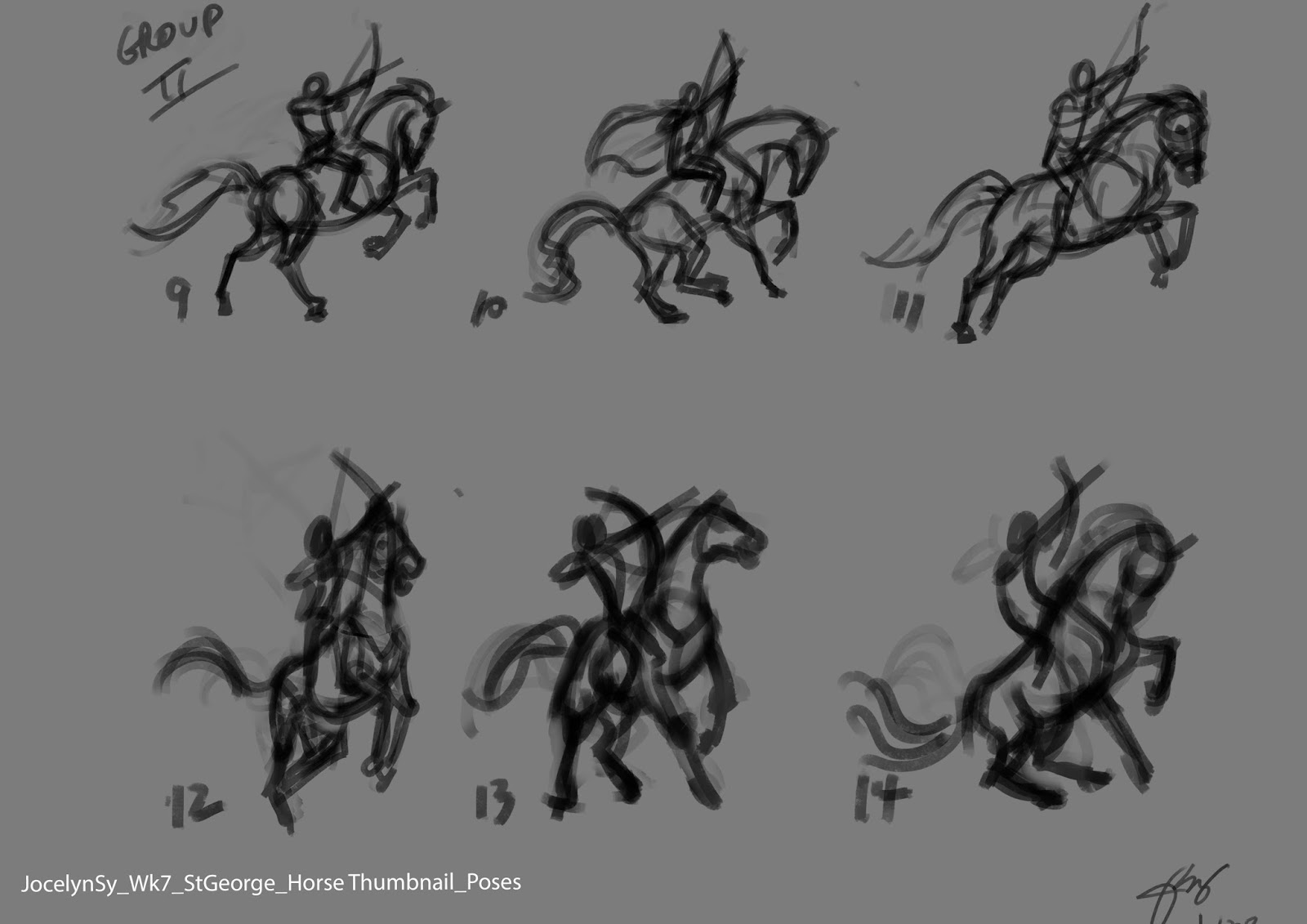
Another note given was to create more studies on different poses for the horse and the dragon. I focused on the St. G and the horse first and came up with these.....
On this first set of thumbnails, I was trying to convey movement and fear on the horse, so I had it facing away from the dragon, trying to get away, while St. G is aiming his arrow to the dragon. The feedback I got for these said that the horse seem weak.
And so, I made another set of thumbnails. This time, I had the horse facing the dragon more and less body twisting. I got favorable feedback for horse 10,11,13,and 14.
Next was the dragon. Here's 4 different dragon poses, then using the 4 selected St G and horse poses, I mixed and matched them to these dragon poses. Here they are....
At this point, I still haven't decided which one I will go for. The final look and design of the characters will be decided upon as I go. The background would be secondary and it would be designed around these characters. Things can still evolve later on. Then finally the colors. That would be all done next week....I hope.
To see previous weeks, click here : Week 1, Week2, Week 3, Week 4, Week 5, Week 6,
Monday, November 18, 2013
Wk 5 Digital Painting - Big Master Study
For this week, I only managed to do one part of the assignment, which was to do a big master study, with at least 1 full body figure and a landscape background. So I chose William Bouguereau's Homer and his Guide (1874) for this assignment.
I decided to start the painting in tonal values, to prevent me from getting distracted with colors at a stage where I want to accurately capture the correct proportions and likeness of the original. I placed the characters and the dog on separate layers so that any adjustments later on would be easier. It seemed that this is a slower method. It took me 5 days to finish Homer, the boy and the dog. But it only took me a day to add colors to them. I wonder how long it would have taken me if I used the other method of painting them straight in color.
For the background, I decided to use the second method and it took me just over 2 days to finish it, together with the additional characters and dogs in the background. Since they are secondary characters, I can be a little less accurate with them. These extra characters are on separate layers as well. I also divided the background into 3 layers: BG, middle ground, foreground, so that I can paint them in broad strokes. I used some custom brushes for the clouds, rocks, ground. I didn't attempt anymore to match exactly the original background but just tried to capture the essence of it, as I don't have the patience to. Same with adding the texture of the basket. I hand-painted it as I haven't discovered any PS tricks yet to do it quickly.
For Homer, the boy and the dog, I used a custom brush called Tyrion from the Shaddy's brushes collection. I'm liking that brush that it's mostly the only brush I use. I tried to capture the likeness of the original, but for the details like their hair, and the dogs fur, it's not an exact copy. Again I have no patience and don't see the point, except to just capture the essence of them. Even for the color palette, it's just an approximation. I think I got it pretty close.
I wasn't expecting to finish this assignment on time, but I did. But I ran out of time for the animal studies. I knew that that would be the case, so selecting this painting is a chance for me to at least have some animals incorporated in it already.
Here's my study for the week in progressive versions... ( click to enlarge)
To see previous weeks, click here : Week 1, Week 2, Week 3, Week 4
Sunday, November 3, 2013
Wk 3 Digital Painting- The Head In Color And Painting Fur
My digital painting journey continues....
Continuing with last week's lesson on value study, this week our assignment is to paint portraits in color, using two methods. One is adding colors using layers. The other is color mixing with brushes.
In the first method, I chose William Adolphe Bouguereau's Le Petite Mendiante as my Master study. In this method, we start with a black and while value study , then on another layer we will add color. Since I did the value study of a Vienna statue last week, I was pleasantly surprised that I was faster with this assignment. I almost managed to finish this value study in a day! (It took me more than three days with the statue.) I was really pleased.....(click to enlarge)
The following day, I added more refinements and details to the value study, thinking that if I do more at this stage, adding color to it would be faster. So I added the wrinkles on her blouse and worked on her tones further, flipping it often to catch any distortions and off-proportions. I'm really getting the hang of working in Photoshop with it's Distort and Warp tools. I'm still just using two basic default brushes here, brushes 5 and 6. Now that it's done, it's time to add colors.
So the same day, I added the colors. Like I suspected, it was quicker. I glazed the colors on top with another layer which is set to Color mode. Although, I realized that some colors became muddy as we have been told, so it wasn't as simple as I originally thought. I added another layer and mixed and blended the colors normally to achieve the correct color.
I made further adjustments and finished it off the same day. I have to make sure I have enough time to do the other method and there's still the animal paintings to do as well. So here's the final version.
The following day, I started with the second method, where we start with colors right away. Because I haven't done this method before, it seem to take me longer. I cheated with the color palette where I used the color picker to pick the colors off the original, instead of picking it myself. I think if I gain more experience with this method, it might prove to be a faster method. For this study, I chose Lord Frederic Leighton's Biondina painting. Here's the rough version...
Continuing still the same day, I worked on it further, adding details on the hair and clothes and refined the face. I was trying to capture the likeness, but in the end, the closest I can get her to look like is..... her older sister. haha.
I have to let it go, or I'll never finish the other half of my assignment for the week.
The next day, I now focused on animal painting, where we were to paint two animals - a long-haired and a short-haired.
I chose a cute lion cub for the long-haired animal. I guess after spending 2 days painting directly with colors, gave me enough familiarity and practice that I managed to finish this painting in a day. I'm really pleased with my speed and the outcome. Here's it is in progressive versions....
Then for the last one, a short-haired animal, I chose the horse. And just like the lion cub, this also took me a day to finish.
With fur, there are custom brushes that we can use. Unfortunately, my Photoshop version isn't compatible with my instructor's brushes so I downloaded those I found elsewhere. I'm still trying to figure out how to use those fur brushes. I found them not suited to how I want it to look,because the strokes are in the wrong direction. So I just used some of it sparingly on the horse, but not on the lion cub. Maybe I'm using it wrongly, I will have to ask Anne, my teacher about that.
In a matter of days, I think that I'm really adapting to the second method of painting quickly. This is really exciting for me. I can't wait to learn more....
To see previous weeks, click here : Week 1, Week 2
Subscribe to:
Posts (Atom)