Saturday, December 14, 2013

Bunny Rabbit Now Animated!!!

***Update: A 2017 newer version of Bunny can be seen here.

      This is a long overdue idea. Now that I have the time, finally made this.

      Starting with just one digital painting of Bunny Rabbit done in Photoshop, I made a 10-drawing animation cycle by re-using and revising the same artwork to create the dancing movement.  Took me the whole day....


Tuesday, December 10, 2013

Final Wk Digital Painting - St George & The Dragon

    In this 8th week, after doing thumbnails and brainstorming about the composition, character designs, poses, and color for the St.George Slays the Dragon painting, and arriving at a consensus with my instructor on which of those studies I should go for, I've decided to start the painting in greyscale and deal with the colors much later after I resolve the design and poses of the characters first. Understanding colors is still a challenge and difficulty for me.  So I need to approach this painting in a slow and methodical way.  

     Focusing first on the main characters, I started sketching and painting the horse, which I've decided would be white. Gathering references for the horse was quite a challenge, since it is an original design, and it was difficult to find an exact pose like that of my horse design. So I just relied on what I know and looked at different photo references and hopefully, it looks believable. Here is the initial stage of the painting of the horse in greyscale. (click to enlarge)

     Then St. George was next, I haven't resolved his design and costume yet, so his look evolved as I went on. Same with the design and colors of the dragon. This is how I am, ideas doesn't come to me quickly enough. I seem to get ideas as I go, thus making my painting process quite slow, and time consuming.  Here's the initial design for St.George...


     After a good night's sleep and fresh eyes, I looked again at my design of St. George and now disliked it. So I spent another day changing his look, pose and costume completely. I have to gather some photos of good-looking Hollywood actors as reference, and I got inspired by the idea of a superhero. So.... my St. George kinda look like the Man of Steel. Haha. I revised his costume to be more a black sculpted armour with a cross in the middle of his chest. And of course... a cape.  He's not wearing any helmet, so we can see his face more. I know.... he's more vulnerable against the dragon's fire, but who wants a hero you can't see the face of. I digress.... So here's the new design of St. George with a cape now. I also started sketching the dragon in a bit more detail...


 Then I started blocking the dragon roughly and revised George's cape to be flowing more upward. 


    The following day, I found the dragon's wings seem lacking in terms of design so I revised it to look like it's tattered. I also added some horns on his head to make him look more fierce and scary.   He's the bad guy in this piece representing evil, so the uglier and bad he looks, the better.... At this stage, I'm quite satisfied with the designs of the characters that it's now time to add colors.


     For the colors, I wanted the setting to be dark, maybe around dawn before the sun rises.  And yes, the cape is red.  Then I clumsily tried to figure out the lighting scenario of this piece and this is what I came up with.

  Not quite sure how I'm doing in terms of colors, I asked a friend who have more experience in digital painting to have a look at this. He kindly gave me some suggestions and I love what he did that I almost followed everything he suggested. Thanks to my animator friend, Chan Ghee Leow, for giving me some useful tips.  Here's an improved version.  The lighting is more intense and dramatic. The dragon seem to want to burst into flames in demonic anger. Hahaha..


I further added some background details and improved on the dragon details. Darkening the scene a bit more. 


 I further revised the pose and design details of the dragon and clarifying a bit more it's details. There's a subtle secondary light coming from above that I wanted to include which signifies God.


      Playing around with the colors and lighting further, I finally settled on this one where the colors are a bit purple-ish and the scene a bit more darker.   After an incredibly exhausting 8 weeks, here, finally, is my first concept digital painting of St George Slays the Dragon.


     I still have so much to learn in terms of colors and light, aside from digital painting techniques, composition, and character designs.  And I think it would take me some more time and experience to be able to judge objectively the quality of my own work. But for now, I consider this an accomplishment, and a start. Prior to undertaking this course, I always find digital painting intimidating.  Now that I've taken these first steps, it doesn't seem that unachievable for me anymore.

      To see previous weeks, click here : Week 1, Week2, Week 3, Week 4, Week 5, Week 6, Week 7


Monday, December 2, 2013

Wk 7 Digital Painting - Redesigning A Myth

       After weeks of getting used to digital painting using Photoshop, it is now a chance for me to put what I've learned into creating my own digital artwork.   Last week, I playfully designed my own dragon, something that's not a particular interest of mine, but I enjoyed the process just the same.  Using the moodboards and research I've already started last week, I decided to continue this subject and will now try to redesign "St George Slays The Dragon" painting. 

       So week 7 is all about thumbnails and brainstorming. Quick and dirty, just laying out ideas about what the story will focus on, and how it would look like.  Here's the rough thumbnails I've came up with... ( click to enlarge)

     I haven't decided on how the dragon would look like at this stage, but just playing around with composition.  I've decided St. George to use arrows to fight the huge dragon, riding his white horse.  He needs to be able to get away from the dragon fast if he needs to.  I'm also adding light as a symbolic element, to represent God or Grace to help him win over the dragon which is the symbol of evil.  

     So the first two panels, the dragon would have wings, and the lower two panels, the dragon would be huge but wingless. I'm focusing on the main characters in the scene first, and on how to stage the story.  The background at this stage isn't clearly defined yet.  

      The first panel is a direct face-to-face confrontation. The second (top right) is the ending where the dragon is already killed, and St. George gratefully looks up in prayer.  The third (lower left) is another version of the confrontation, where the dragon is bigger, but wingless, and St.George using the horse's speed, tries to outrun it while aiming his arrow for a shot.  The last panel ( bottom right), St. George, with a torch in his hand trying to lure the huge dragon, also wingless, to chase after him, probably to a trap. 

    
     After this, I decided to add some colors to these and see what I can come up with...


     Adding colors can be fun and intimidating at the same time.  It's a very unfamiliar territory for me, since I've never done any original painting before. So this is a real exploration and experiment.  My choices here are probably very amateurish at this point and only time and experience will tell me later, whether these choices are any good or not. And I suspect, I'll probably cringe in embarrassment, of how terrible my choices had been. Haha...

     My color choices at this point relies heavily on what that color feels to me.  So I'm keen to learn more about color theory. I'll probably read up on that subject later on.   

   After submitting these,  the consensus was to focus on the first panel, where the height of tension and action is the main story.  I got some feedbacks regarding the size of the panel and it was suggested that I can still lengthen it horizontally, more like a cinematic 16:9  camera ratio.  I like that idea, and will definitely do that on the actual painting.

     
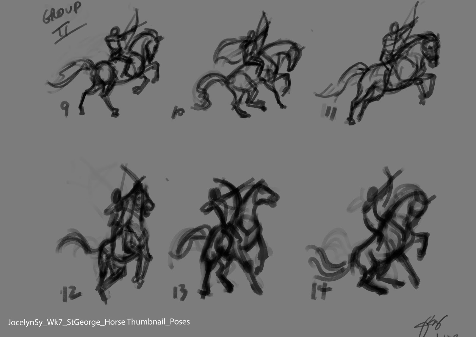
    Another note given was to create more studies on different poses for the horse and the dragon. I focused on the St. G and the horse first and came up with these.....


     On this first set of thumbnails, I was trying to convey movement and fear on the horse, so I had it facing away from the dragon, trying to get away, while St. G is aiming his arrow to the dragon. The feedback I got for these said that the horse seem weak.


 And so, I made another set of thumbnails. This time, I had the horse facing the dragon more and less body twisting.  I got favorable feedback for horse 10,11,13,and 14.

     Next was the dragon. Here's 4 different dragon poses, then using the 4 selected St G and horse poses, I mixed and matched them to these dragon poses.  Here they are....


      At this point, I still haven't decided which one I will go for.  The final look and design of the characters will be decided upon as I go. The background would be secondary and it would be designed around these characters.  Things can still evolve later on. Then finally the colors.  That would be all done next week....I hope.

       To see previous weeks, click here : Week 1, Week2, Week 3, Week 4, Week 5, Week 6,