Showing posts with label Drawings. Show all posts

Monday, March 16, 2015

Animal Drawing - Week 6

 To see previous weeks, click week1, week 2, week 3, week4 . week 5

For week 6, the lectures and assignments are about  drawing  unusual shaped- animals.  These are the fishes, and reptiles. It's also about how much or less details, textures are indicated so as not to kill the drawings.   This is something I plan to practice on even after this workshop is done.

Here's what I've done. ( click to enlarge)


Monday, December 2, 2013

Wk 7 Digital Painting - Redesigning A Myth

       After weeks of getting used to digital painting using Photoshop, it is now a chance for me to put what I've learned into creating my own digital artwork.   Last week, I playfully designed my own dragon, something that's not a particular interest of mine, but I enjoyed the process just the same.  Using the moodboards and research I've already started last week, I decided to continue this subject and will now try to redesign "St George Slays The Dragon" painting. 

       So week 7 is all about thumbnails and brainstorming. Quick and dirty, just laying out ideas about what the story will focus on, and how it would look like.  Here's the rough thumbnails I've came up with... ( click to enlarge)

     I haven't decided on how the dragon would look like at this stage, but just playing around with composition.  I've decided St. George to use arrows to fight the huge dragon, riding his white horse.  He needs to be able to get away from the dragon fast if he needs to.  I'm also adding light as a symbolic element, to represent God or Grace to help him win over the dragon which is the symbol of evil.  

     So the first two panels, the dragon would have wings, and the lower two panels, the dragon would be huge but wingless. I'm focusing on the main characters in the scene first, and on how to stage the story.  The background at this stage isn't clearly defined yet.  

      The first panel is a direct face-to-face confrontation. The second (top right) is the ending where the dragon is already killed, and St. George gratefully looks up in prayer.  The third (lower left) is another version of the confrontation, where the dragon is bigger, but wingless, and St.George using the horse's speed, tries to outrun it while aiming his arrow for a shot.  The last panel ( bottom right), St. George, with a torch in his hand trying to lure the huge dragon, also wingless, to chase after him, probably to a trap. 

    
     After this, I decided to add some colors to these and see what I can come up with...


     Adding colors can be fun and intimidating at the same time.  It's a very unfamiliar territory for me, since I've never done any original painting before. So this is a real exploration and experiment.  My choices here are probably very amateurish at this point and only time and experience will tell me later, whether these choices are any good or not. And I suspect, I'll probably cringe in embarrassment, of how terrible my choices had been. Haha...

     My color choices at this point relies heavily on what that color feels to me.  So I'm keen to learn more about color theory. I'll probably read up on that subject later on.   

   After submitting these,  the consensus was to focus on the first panel, where the height of tension and action is the main story.  I got some feedbacks regarding the size of the panel and it was suggested that I can still lengthen it horizontally, more like a cinematic 16:9  camera ratio.  I like that idea, and will definitely do that on the actual painting.

     
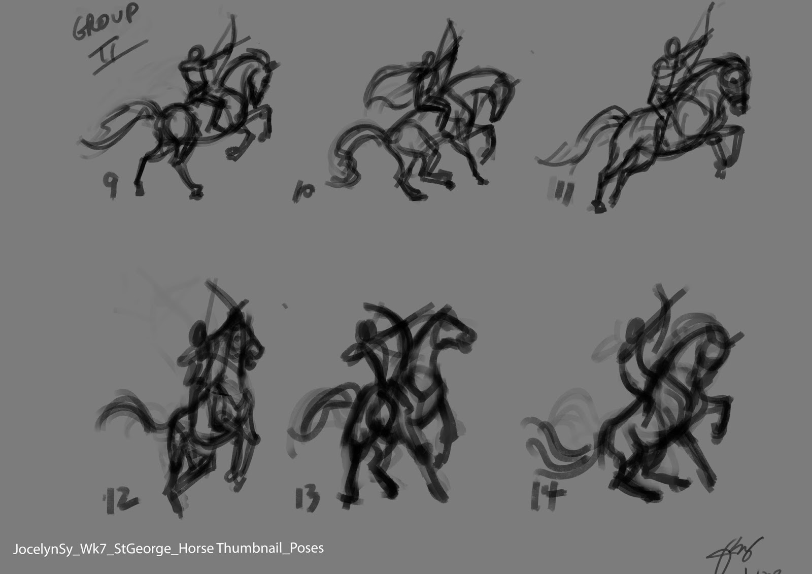
    Another note given was to create more studies on different poses for the horse and the dragon. I focused on the St. G and the horse first and came up with these.....


     On this first set of thumbnails, I was trying to convey movement and fear on the horse, so I had it facing away from the dragon, trying to get away, while St. G is aiming his arrow to the dragon. The feedback I got for these said that the horse seem weak.


 And so, I made another set of thumbnails. This time, I had the horse facing the dragon more and less body twisting.  I got favorable feedback for horse 10,11,13,and 14.

     Next was the dragon. Here's 4 different dragon poses, then using the 4 selected St G and horse poses, I mixed and matched them to these dragon poses.  Here they are....


      At this point, I still haven't decided which one I will go for.  The final look and design of the characters will be decided upon as I go. The background would be secondary and it would be designed around these characters.  Things can still evolve later on. Then finally the colors.  That would be all done next week....I hope.

       To see previous weeks, click here : Week 1, Week2, Week 3, Week 4, Week 5, Week 6,


Saturday, October 26, 2013

Wk 2 Digital Painting - Head Value Study And Animal Drawing

     For the longest time, it's been my desire to learn how to paint digitally in Photoshop. Now that I have the time, I started taking an online digital painting course last week. Even though I'm not exactly a beginner in drawing, I am a beginner in digital painting especially in Photoshop.  I am pleasantly surprised, that I became comfortable with Photoshop quickly, after learning a few tips on how to navigate the interface. That week was sort of a warm-up.
     
     This week, I got a taste of how it's like to paint digitally.  Oh boy.... it's was quite a challenge. I didn't realize that painting takes longer, and requires a lot of patience.  After watching my instructor's painting demo, I started to do the assignment,  Using the sketch of the Vienna statue that I did last week, I scaled it up to just focus on the head for this week.

     My first difficulty was blending.  I didn't know how to digitally blend the colors using the brush tool and the color picker.  I spent hours and hours struggling on this till my hand hurts. This was what I managed that day... She looks angry at me already. Haha... (click to enlarge)


     The following day, I worked on it again,and managed to get the hang of blending that I was pleased with the outcome. I managed to soften her expression.  At least she doesn't look angry anymore. I blocked out the hair and arm roughly. This allowed me to focus on other areas, when I got tired of working on the face.


      On the third day, I continued on. The face keeps evolving as I work on it. At one point, I painted the lips much too luscious, it looked like Angelina Jolie's lips.  I have to tone it down.  A good tip Anne told us is to flip the image to get a fresh eye. I knew that, but forgot about it until Anne mentioned it. That helped a lot. I saw some distortions and managed to fix it on this version below.


        I was pleased with what I've done with the head so far and decided to take a break from it for awhile. I decided to work on the other part of our assignment, which was to draw animals in interesting poses on a black background. So I did this....  
                                               Photo Image by Leslie Thief
      The following day, back to the head painting, I decided to finish it up already, because there's more animal drawings to do. I worked on the hair, neck and arm area, plus a bit of the background, I tried to fix the face a bit of any distortions.  By this time, my hand started to really hurt, due to my previous RSI.   I decided to leave the head study for now and proceed with the animal drawings, and if there's still time, I will work on it later.  At this stage, I was happy with the result.

                             
     So after painting intensely for a few days by now, drawing animals was a welcome break.  I enjoyed drawing them that I drew 6 more animals over two days.
                               
Photo Image by Draco Art Stock
Photo Image by Bahaloo
Photo Image by Chunga Stock
Photo Image by Hot N Stock
Photo Image by Deseo Nocturno
      Whew.... I've finished all the assignment for this week and I still have a few days left to spare.  So, I thought of going over the head study again and see if I can polish it up a bit. After a few hours of tweaking it, I decided to let it go.  I don't want to mess it up unnecessarily.    So here is the final head value study.

     It's been a very intense and productive week for me, I started out fumbling over how to blend the colors. After hours and hours spent just figuring it out, I managed to get the hang of it by the end of the week. Not too bad.... It's not perfect by any means, but for a start, this is really, really promising. :)

     To see previous weeks, click here : Week 1


Tuesday, July 23, 2013

Drawing Bambi's Head

     Disney's animated classic " Bambi " is one of my favorite Disney movie.  When I was at Disney Australia, I had a chance to worked on the sequel "Bambi 2", but I didn't have a chance to animate Bambi. At that time, I was afraid to tackle that character, not having much experience animating 4-legged animals before, and with the high quota expectations, I didn't think I could do a good job with that character, so I chose to work on Thumper instead, another favorite of mine.  I enjoyed Thumper a lot and no regrets.  Now that I'm reminiscing about it, I thought of doing some drawings of Bambi just for the fun of it. No pressure.
       So here's my accelerated speed- drawing videos of Bambi's head.   Ooh... how I wish I really draw that fast.


Monday, June 17, 2013

Final Week - Fundamentals Of Character Design

      For the final week of the course, the topic was Appeal And How To Achieve It.  Clear and easy to read silhouette is the key.  Combining all the principles we've learned for the past 7 weeks, we're to do the following for the final assignment, focusing on appeal:
   1) A Raccoon that is a leader and a hero archetype, without costume,   Or a steampunk female that is a leader and hero archetype. Showing the rough and clean version.  I chose the raccoon.
   2) Rough design of two characters interacting: 
Female with an elephant- theme and story moment is students idea.  
Focus on making an appealing situation based on the clarity of silhouette of two characters as one complete strong compositional image and stimulating interaction, creating an intriguing storyline through a single image .All of this in order to make the viewer wanting to know more of what is going on.  Style is students choice.

     Here's what I've done..(click to enlarge)


Tuesday, June 11, 2013

Week 7 - Fundamentals of Character Design

      "Character Staging and Setup"  was the topic for week 7.  The assignment for the week was to do two master copies of Frank Frazetta's work in black and white, using only two values, and transitions.  And create two scenarios, that demonstrate  good composition, pose, camera placement,spacing, lighting,
1. Character detained, imprisoned, alone and hopeless (students choice of subject and setting)
2. Character heroic, victorious, superior (students choice of subject and set)
Plus a page of hands and feet.
    
     Here's what I've done.. (click to enlarge)


Monday, June 3, 2013

Week 6 - Fundamentals Of Character Design

     Design Details and Shape Breakdown was the topic for week 5.  Nico Marlet's work is the inspiration for the week.  Our assignment was to do a master copy of one of his work,  and we're to design a dragon and his rider, in two styles -  one is a more cartoony graphic style, and another in in a more realistic style. 

     Here's what I've done...(click to enlarge)


Monday, May 27, 2013

Week 5 - Fundamentals of Character Design

      "Creating Forms From Abstract Shapes".  Starting with a simple, appealing abstract shapes, we're to create three-dimensional form on a two-dimensional plane. This technique utilizes an understanding of the fundamentals of tone, value, form, lighting, texture.   Carter Goodrich's work best demonstrates this technique.  So we're to do a master copy of one of his work.  He's now my new favorite.   I copied his drawing of one of the rats in Ratatouille. 

     Combining our previous understanding of shape language of visual association, character personality using body/facial expressions, we're to design using this technique, two characters -  1)  a proud, confident, heroic cowboy/cowgirl.  2) an unmotivated, lethargic, depressed four-legged animal character.

     So, here's what I've done.... (click to enlarge)


Friday, May 24, 2013

Week 4 - Fundamentals of Character Design

     Week 4 was about Character Personality. Starting with correct gesture, a clear silhouette plus understanding the character from within would help design or draw the right body poses to express character's personality and/or emotions. So that week, we were given a number of descriptive scenarios to draw.  

     Heinrich Kley was the one of my favorites and the inspiration for that week.   We're also to do a master copy of one of his drawings while studying the loose and gestural quality of his characters' poses.   I chose his famous dancing elephants.  I've always admired Heinrich Kley's drawings, but not until I was copying them that I got to see it more clearly how much personality, energy and anatomy he integrated in those anthromorphic characters. Simply awesome!  I got a glimpse of how a master artist like him thinks. I'll definitely be doing more master copying on my own after the course. Simply a fun way to learn.

      So, here are my assignment drawings.... ( click to enlarge)


Sunday, May 19, 2013

Week 3 - Fundamentals Of Character Design

     Week 3 was about Visual Association.  Using the shape language of square, circle and triangle, we're to design three barbarians, one male, two females, describing the following archetypes:
- Routine, orderly, rule follower - but also timid and shy.
- Leader, proactive, aggressive -but also selfless and warm.
- Peace keeper, kindhearted - but also slightly sadistic and cynical, including their props.
Plus more sketchbook drawings, designing from life.

     David Colman always tell us, drawing or designing is more thinking than actual drawing.  By using the shape language of square, circle and triangle and combining them will achieve the design that conveys the personality and appeal of the characters. Each of the primary shapes is associated with certain meaning or evoke certain feelings, that we consciously or unconsciously perceive and understand. And if the right combination is done, good design results.
 
     So I spent most of the time thinking about the designs, poses, shapes, their meaning and doing rough sketches in the process. Part of  the challenge was to illustrate what seemed to be opposing or contradictory character descriptions like,
"kindhearted but slightly sadistic and cynical".  Wow, that really got me thinking. Nevertheless, that week's lecture have been very enlightening for me.

     As for the sketchbook drawings, I drew some animals from videos, as I didn't have enough time left. Fortunately, there's a good resource for artists like me, who sometimes can't go to the zoo. That is Rhino House

     I was really tired after that week's assignment.  And  in spite of my right hand becoming sore after, I totally enjoyed doing them,  (click to enlarge)


Leader, proactive, aggressive -but also selfless and warm.

Routine, orderly, rule follower--but also timid and shy.

Peace keeper, kind hearted --but also slightly sadistic and cynical.