Showing posts with label Gesture. Show all posts

Monday, December 2, 2013

Wk 7 Digital Painting - Redesigning A Myth

       After weeks of getting used to digital painting using Photoshop, it is now a chance for me to put what I've learned into creating my own digital artwork.   Last week, I playfully designed my own dragon, something that's not a particular interest of mine, but I enjoyed the process just the same.  Using the moodboards and research I've already started last week, I decided to continue this subject and will now try to redesign "St George Slays The Dragon" painting. 

       So week 7 is all about thumbnails and brainstorming. Quick and dirty, just laying out ideas about what the story will focus on, and how it would look like.  Here's the rough thumbnails I've came up with... ( click to enlarge)

     I haven't decided on how the dragon would look like at this stage, but just playing around with composition.  I've decided St. George to use arrows to fight the huge dragon, riding his white horse.  He needs to be able to get away from the dragon fast if he needs to.  I'm also adding light as a symbolic element, to represent God or Grace to help him win over the dragon which is the symbol of evil.  

     So the first two panels, the dragon would have wings, and the lower two panels, the dragon would be huge but wingless. I'm focusing on the main characters in the scene first, and on how to stage the story.  The background at this stage isn't clearly defined yet.  

      The first panel is a direct face-to-face confrontation. The second (top right) is the ending where the dragon is already killed, and St. George gratefully looks up in prayer.  The third (lower left) is another version of the confrontation, where the dragon is bigger, but wingless, and St.George using the horse's speed, tries to outrun it while aiming his arrow for a shot.  The last panel ( bottom right), St. George, with a torch in his hand trying to lure the huge dragon, also wingless, to chase after him, probably to a trap. 

    
     After this, I decided to add some colors to these and see what I can come up with...


     Adding colors can be fun and intimidating at the same time.  It's a very unfamiliar territory for me, since I've never done any original painting before. So this is a real exploration and experiment.  My choices here are probably very amateurish at this point and only time and experience will tell me later, whether these choices are any good or not. And I suspect, I'll probably cringe in embarrassment, of how terrible my choices had been. Haha...

     My color choices at this point relies heavily on what that color feels to me.  So I'm keen to learn more about color theory. I'll probably read up on that subject later on.   

   After submitting these,  the consensus was to focus on the first panel, where the height of tension and action is the main story.  I got some feedbacks regarding the size of the panel and it was suggested that I can still lengthen it horizontally, more like a cinematic 16:9  camera ratio.  I like that idea, and will definitely do that on the actual painting.

     
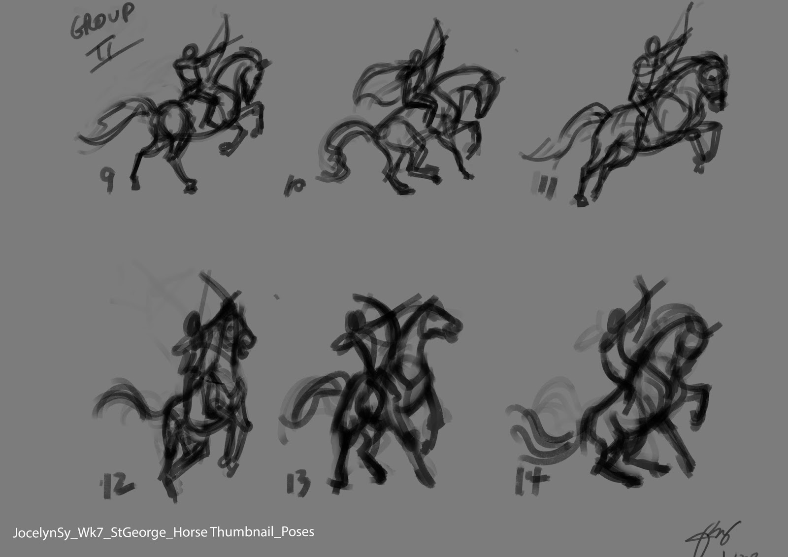
    Another note given was to create more studies on different poses for the horse and the dragon. I focused on the St. G and the horse first and came up with these.....


     On this first set of thumbnails, I was trying to convey movement and fear on the horse, so I had it facing away from the dragon, trying to get away, while St. G is aiming his arrow to the dragon. The feedback I got for these said that the horse seem weak.


 And so, I made another set of thumbnails. This time, I had the horse facing the dragon more and less body twisting.  I got favorable feedback for horse 10,11,13,and 14.
     Next was the dragon. Here's 4 different dragon poses, then using the 4 selected St G and horse poses, I mixed and matched them to these dragon poses.  Here they are....


      At this point, I still haven't decided which one I will go for.  The final look and design of the characters will be decided upon as I go. The background would be secondary and it would be designed around these characters.  Things can still evolve later on. Then finally the colors.  That would be all done next week....I hope.

       To see previous weeks, click here : Week 1, Week2, Week 3, Week 4, Week 5, Week 6,


Saturday, October 19, 2013

Absolutely Enjoying This...


    I'm at it again - another online drawing course!   I'm taking a break from animating, now that I'm out of work and jobless again. So I should just as well use this time to hone and improve my drawing skills, and learn how to digitally paint, while avoiding getting depressed over the instability of the animation industry, and my joblessness.

    So...this time I enrolled in a Digital Painting 8-week course.  I have been waiting for a chance to do this course to finally learn how to handle Photoshop. I have been putting off learning Photoshop, because after having to learn a very technical 3D program Maya before and found it hard, learning another digital program seem daunting to my non-technical brain.

     I had some initial confusion and unfamiliarity with the user interface of PS CS5, compared to that of my instructor's CS6.  The good thing is she helped me immediately through live chatting on how to navigate and learn a few tips to help me on our first week's assignment,  After that, I was able to managed well this first week.  Fortunately for me, Photoshop isn't that scary after all.  I'm presently using Photoshop CS5 Trial version. If I eventually find that this is a program I would like to use for drawing and painting, then I'll probably invest in the full version later on.  

     I chose this course because it both involves figurative and animal drawing.  And I thought what could be a better way to learn Photoshop than to learn it by drawing and painting humans and animals at the same time, which I both like. So I'm sold! 

     For the first week, we're asked to do some exercises doing figure and animal drawings to get use to drawing with a tablet while using Photoshop.  Fortunately for me, I don't have to struggle drawing digitally with a tablet, because I have a Cintiq.:P

       These are what I've done so far.....(click to enlarge)


Photo Image by Cyborg Suzy Stock
Photo Image by Lesley Thief
Photo Images by Draco Art Stock


Photo Image by Tala Stock


       I did these quick sketches below, using the Animal Practice tool from this website - Figure and Gesture Drawing  
Setting the timer for 2 minutes,


         And here's a preparatory sketch of a Vienna statue, for our week 2 lesson. Can't wait....


            ***Human and animal references used here are from http://artists.pixelovely.com ; http://characterdesigns.com; http://www.deviantart.com
    

Monday, May 27, 2013

Week 5 - Fundamentals of Character Design

      "Creating Forms From Abstract Shapes".  Starting with a simple, appealing abstract shapes, we're to create three-dimensional form on a two-dimensional plane. This technique utilizes an understanding of the fundamentals of tone, value, form, lighting, texture.   Carter Goodrich's work best demonstrates this technique.  So we're to do a master copy of one of his work.  He's now my new favorite.   I copied his drawing of one of the rats in Ratatouille. 

     Combining our previous understanding of shape language of visual association, character personality using body/facial expressions, we're to design using this technique, two characters -  1)  a proud, confident, heroic cowboy/cowgirl.  2) an unmotivated, lethargic, depressed four-legged animal character.

     So, here's what I've done.... (click to enlarge)


Friday, May 24, 2013

Week 4 - Fundamentals of Character Design

     Week 4 was about Character Personality. Starting with correct gesture, a clear silhouette plus understanding the character from within would help design or draw the right body poses to express character's personality and/or emotions. So that week, we were given a number of descriptive scenarios to draw.  

     Heinrich Kley was the one of my favorites and the inspiration for that week.   We're also to do a master copy of one of his drawings while studying the loose and gestural quality of his characters' poses.   I chose his famous dancing elephants.  I've always admired Heinrich Kley's drawings, but not until I was copying them that I got to see it more clearly how much personality, energy and anatomy he integrated in those anthromorphic characters. Simply awesome!  I got a glimpse of how a master artist like him thinks. I'll definitely be doing more master copying on my own after the course. Simply a fun way to learn.

      So, here are my assignment drawings.... ( click to enlarge)


Tuesday, May 14, 2013

Week 2 - Fundamentals of Character Design

     For week two, the topic was about Designing from Life.  Curve lines convey rhythm or softness  while straight lines convey structure or strength.  A balance of both  results in good design.

     So for the assignment, first, we're to do figure drawings from the photos provided, starting with loose gesture, then design them using curves and straight lines.  Secondly,  do more coffee shop sketches, focusing on designing the people we see, than just simply drawing them. Then thirdly, we were to design the adjective "Depressed". 
   
     I'm not used to sketching in public, but since week 1, I think I'm getting the hang of it.  It was raining that weekend, so no zoo this time. Just went to the indoor foodcourt nearby.

     Here's what I've done for week 2.... (click to enlarge)


Saturday, April 28, 2012

Drawing - Back To Basics


              Since I started doing 3d animation, I have not been drawing much.  The most obvious reasons are lack of time and energy, if not interest.  This year, I decided to change that.  So I enrolled in a figure drawing course, to get me to drawing again.  I'm taking Analytical Figure Drawing with Michael Hampton over the CGMA Online Masterclass. It's back to basics for me.

              For our first week, we were asked to do a hundred gesture drawings, and out of that we were to submit only 5 for critiques.  I did more than that, because I got carried away.   I did mine from photographs. In the beginning, I tried timing it from 60, 90 seconds to 2 minutes. But later I stopped timing it altogether, because analyzing the pose and figuring out how to best approach it took me longer.  The idea is to capture the story of the pose and do it with economy of lines.  Sounds easy but not really.  But I had fun doing it though.

               Here's some of them... (click to enlarge)


                           Below are the ones I like...